Billboards are very effective when used as part of an overall marketing strategy to build brand awareness or promote a product, campaign or service. However, they aren’t cheap, so even simple mistakes in design or objectives can be costly, resulting in lost revenue and wasted opportunities.
They may not deliver a one-hit knockout, but if no one knows your business exists they can change that quickly, reaching large numbers of people and increasing the recognition and recall of your business. With additional positive effects on conversion rates of all other marketing efforts, from your website to your ads.
However, before you invest in a billboard, it’s important to ensure that your marketing foundations are in place to capitalize on the investment. A billboard may drive traffic to your business, but if your website isn’t up to par, visitors will leave without taking action. That’s why having a well-designed customer-optimised website is key. If you’re in the property sector, having effective sales and marketing collateral—such as brochures and lead-generating downloads—is equally crucial. This is where high-quality graphic design can help craft professional materials that clearly communicate your value proposition.
Additionally, before jumping into any design, it’s essential to understand who your customers are and how best to reach them. This is where a solid customer strategy comes into play, ensuring your message resonates with your target audience.
Recommended reading: 4 Steps to Transform Your Website into a Powerful Marketing Tool
Before You Start
With so many design outsourcing options these days, it’s tempting to skip ahead and take a shortcut direct to design. Or possibly use the free in-house design services often bundled with billboard print and installation costs. Both sound like great deals. And they can be, as long as you know what you’re doing. If not, you could end up with a massive 14-meter sales flyer, which is the last thing you need.
If you are fortunate enough to have a professional advertising agency on retainer or a talented marketing consultant with decades of experience to guide you through the whole process, you can sit back and relax.
But if not, and you’re planning to outsource the design portion of your billboard campaign, you’ll always get what you ask for – but that might not be what you need.
Following these top 10 billboard rules to keep you ahead of the competition (and avoid costly blunders).
Best Practices
There are best practices for almost every aspect of marketing, even billboards. And following them means you don’t have to invest time and money learning what works and what doesn’t. That’s all been done for you.
When it comes to guides and best practices, knowing when to colour inside the lines and when to go against the norm, require balanced and calculated decisions based on a whole lot of variables. It’s why every business needs an experienced CMO.
Until you’re there, it’s best to follow these 10 simple rules for billboard design and you’ll get better results for it.
-
Three Second Rule
-
Seven Words Or Less
-
Make It Memorable
-
Avoid Direct Response
-
Be Smart (But Not Too Clever)
-
Build a Campaign
-
Stand Out
-
Location Location Location
-
Fonts & Logos
-
The Arm’s Length Test
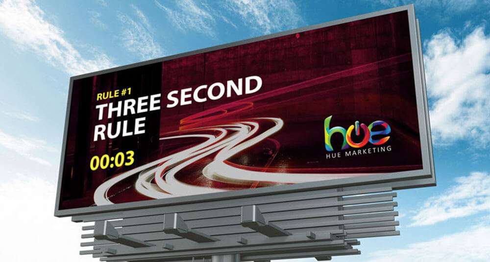
Rule #1. Three Second Rule
The 3-second rule is as straightforward as it sounds. Anyone viewing your billboard should be able to read and understand what you’re telling them in 3 seconds or less. It’s far more difficult than you’d first imagine, and it’s rule #1 for a reason.
If your campaign concept requires more information, explanation or qualification, then billboards are not the correct medium to use. Billboards are strictly single-serve messages. The best billboards get right to the point and are easy to understand. Long stretching highways might get 5-10 seconds of view time, but in and around Phuket, keep it down to 3 seconds.
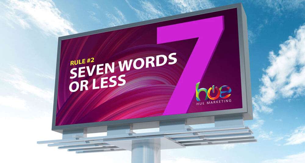
Rule #2. Seven Words Or Less
Large multinational blue-chip companies have invested a lot of time and money testing how much information people can take in at a time. Se we know that we (people) process visuals 60,000 times faster than text. We also decipher image elements simultaneously but language is a much slower process because it’s a linear and sequential process.
❝Don’t fight science. Seven words or less is the optimum length of text for billboards.❞
The temptation to add more information because people will pass your billboard multiple times (over weeks or months) is ridiculous. Don’t do it. Billboards should be a single-serve message.
There is a little bit of flexibility in this rule like if your billboard is at traffic lights or its viewers aren’t in motion at all. But less text is always better.
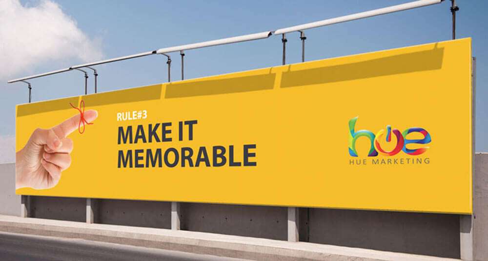
Rule #3. Make It Memorable
For best results, select one idea to communicate and try to make it memorable. Try using the rule of three to keep you focused:
- Visual – the imagery you use
- Message – your 7 words or less
- Takeaway – what the viewer will remember (your CTA)
Your goal should be to create something hard to forget and leave passersby with a desire for more information.
Adding extra information doesn’t improve your billboard’s effectiveness, it reduces it. People remember short, simple concepts far more than complex ones.
Example: Enjoy Coca Cola
Rule #4. Avoid Direct Response
Billboards are perfect for (top of the funnel) tasks like building product or brand awareness. Anyone who wants to know more should be able to find you on Google without much effort.
If the success of your billboard campaign depends on people writing down or remembering your website, email or phone number – you’re not going to get the results you want or expect. This doesn’t mean you can’t include your website as secondary information. Just don’t count on these details being seen, read or remembered. And make sure it doesn’t distract from your main message.
❝Billboards are great marketing tools,
but NOT great sales tools.❞
If you can’t be found online with a simple search for your business name, project, product or service (relating to your billboard campaign), you need to invest in some basic website SEO and update your GMB listing before integrating billboards into your marketing.
There are times you can get away with your website or phone number in the headline, but it would need to be very short and memorable.
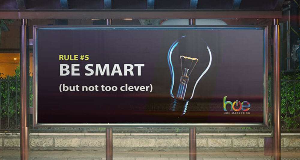
Rule #5. Be Smart (But Not Too Clever)
A well-designed billboard will attract attention and leave an indelible impression. A billboard that tries too hard to be intelligent or “out there” will just get overlooked.
Billboards aren’t supposed to make people scratch their heads and wonder what’s going on. Complex analogies or dense visual imagery aren’t effective. For simplicity keep your creativity to one headline, one logo and one image.
❝Stick to ONE headline, ONE logo and ONE image.❞
The most effective billboards have messages that are straightforward, obvious even. Make good use of imagery that connects with your message and envokes a positive emotion. How people feel when they see your billboard should be how you want them to feel when they think of your brand.
Also, consider your target market, who they are, what they are doing, where they are going. And keep that in mind when developing your message.
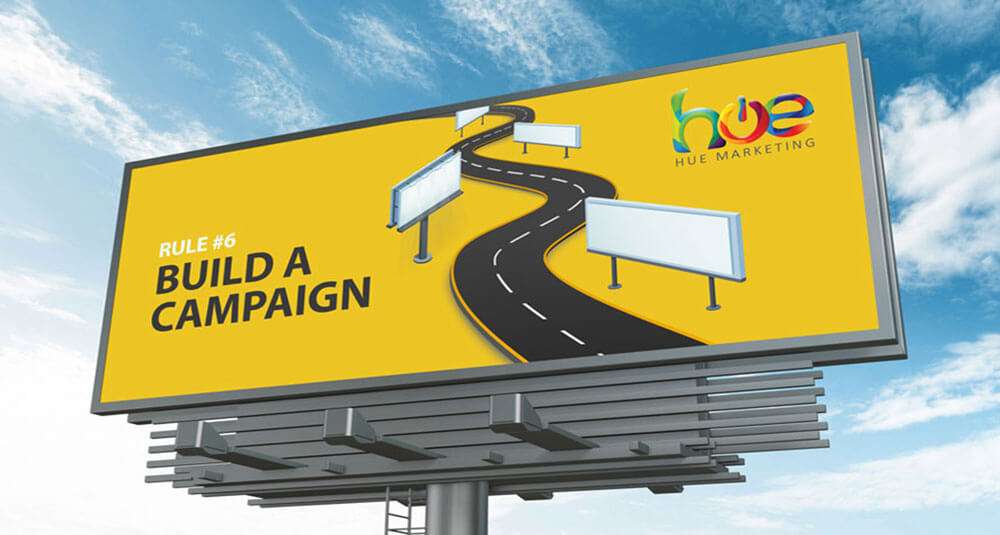
Rule #6. Build a Campaign
Understanding how billboards fit within a bigger marketing strategy is key to any successful billboard advertisement.
A single billboard isn’t cheap, especially in a high-traffic location. But having just one billboard isn’t as effective as having several. More billboards improve your recognition and recall rates, and that’s what you want.
Consistency is essential when you’re trying to get your message across, not just with your billboards but through all your communication channels; social media, advertising, website, flyers, brochures, and any downloadable assets.
You should already have a comprehensive branding guide to follow. This will help keep all your communications instantly recognizable. And you can theme your campaigns to strengthen connections across media platforms. Especially when promoting different product groups or services.
There are times you can get away with your website or phone number in the headline, but it would need to be very short and memorable.
Rule #7. Stand Out!
Make your billboard ideas as unique and clear as possible. After all, you want it to stand out from the other billboards in the area. Following these 10 billboard rules for success will help but you can’t beat a little creative flair.
It’s not uncommon (especially here in Phuket) to see groups of billboards close to each other. In these situations, you’re competing for the same 3 seconds of attention. The one that stands out and is easy to read will win every time. Even if you try to read the complex billboard next to it you’ll find it almost impossible to do.
Billboards compete for a very limited amount of attention. So you want every advantage you can get.
Taking the opportunity to create something distinctive and eye-catching with your billboard can even generate additional free press. So give yourself and your designers time to get creative.
Stand out – but not at the expense of your primary marketing objective.
I used to drive past a billboard (twice a day for 6 months) it featured a sexy lady in a brightly coloured bikini. Unfortunately, the headline, message and even branding were all low contrast white text on sky blue background, and to this day, I still have no idea what product or company the billboard was promoting.
To make things even worse, even though the billboard was in quite a good location on a bend making it visible from both traffic directions, it wasn’t clear from a distance so by the time you were close enough to read the low contrast text it was too late. Your attention was needed back on the road, which brings us nicely to our next rule…
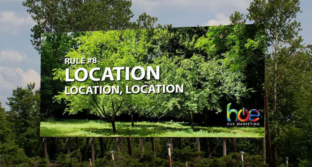
Rule #8. Location Location Location
When picking your billboard location, consider the traffic levels and route, illumination, digital cycle (if it’s a digital billboard). They all factor into choosing the right placement for your sign. Keep in mind, the better the location, the more expensive it will likely be.
Always design your billboard with a final location in mind so you can factor in view time, distractions and much competition you have for viewers’ attention.
It’s not just the geographic location you need to consider either. You also need to be mindful of what’s behind your billboard, so you can contrast your design with its surroundings.
Don’t assume that a billboard design will work in any location. Or that because it works in one location it will be suitable for everywhere.
A design that “pops” on paper can become almost invisible when placed in front of trees and bushes.
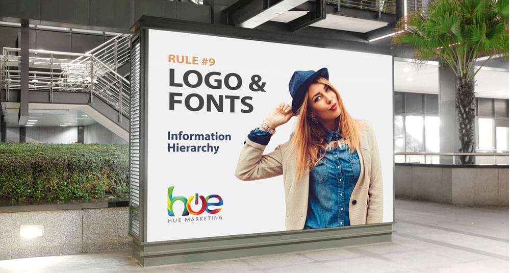
Rule #9. Fonts & Logos
Correct use of fonts and type size will ensure your billboard is readable from various distances. Which is the whole point. Avoid fancy hard-to-read and super thin fonts, and don’t overly condense text.
The size of your text also depends on viewing distance. If your billboard has a clear line of sight right down the road, making your text as large as possible means more people will have longer to read it.
A good place to start is for every 10 feet of viewing distance, your font size should be at least 1 inch (or 72 pt.) tall. For example, if your audience is going to be 40 feet away from your billboard, your lettering must be at least 4 inches tall (or 288 pt.) for it to be legible.
“Make the logo bigger,” is one of the most common pieces of client feedback ever offered in advertising. There is a delicate balancing act to be performed. Too big and it looks awkward and detracts from the message. But if it’s too small to see what’s the point in promoting the business.
When designing your billboard, consider the hierarchy of information just as much as legibility. Deciding on a clear priority of information during the briefing stage is the best way to avoid problems later on.
Rule #10. The Arm’s Length Test
So, you’ve followed all of the guidelines and created a stunning billboard. It features contrasting colours and is fascinating, sleek, and concise.
- But will it, however, be seen?
- Will it be read and comprehended?
Here’s a quick check to see if you’re on to a winner.
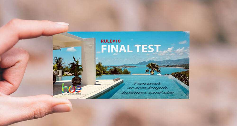
Print your billboard to the size of a business card and hold it away from you at arm’s length for 3 seconds.
Are you able to see everything as clearly as on your screen or high-quality print mockups? If not, go back in and fine-tune it. It needs to pop! Remember that you only have 3 seconds to get your message over.
What Next?
Many of these rules should be addressed in your design brief from the very start of your project, you can download a FREE Graphic Design Brief template to get you started. Keep in mind that if you’re outsourcing your design, you’ll get what you ask for. But it’s your responsibility to know what your business needs to get the best results.
If you’re considering investing in a billboard, the tips above will help ensure your campaign hits the mark. But why stop there? Let us take your design to the next level—whether as part of a larger project or as your impartial, expert consultant. With our guidance, you can elevate your billboard strategy and maximize its impact, making sure your investment pays off in a big way. Reach out today and let’s create something unforgettable!
Free Assessment Offer.
It’s never too late to review your marketing strategies, including how you build your brand. if you’d like to discuss how you could improve your branding efforts, why not book a strategy consultation with Hue Marketing.
Founder of Hue Marketing | Marketing Strategist | Creative Problem Solver
With 30+ years of experience, I help businesses in high-end markets solve complex challenges through strategic insights and quality-driven solutions. Based in Phuket since 2003, I focus on building long-term marketing foundations that drive brand differentiation, higher conversion rates, and lasting customer loyalty.






It made sense when you wrote that the traffic level must be considered when choosing the right location to place your billboard. My friend prefers a crowded place like the airport to catch more people. I should advise her to try airport terminal billboard advertising since it seems ideal for their business.
Great. Airports terminals see a lot of high volume traffic, but the people viewing them can be preoccupied with their own travel plans, so be sure to remind your friend to follow the billboard guidelines described above.
This is a great article with well-scripted, engaging content that is full of original and sensible views. Much of your informative content is in line with my way of thinking.
Thanks Robert, I appreciate your kind words.
It’s good to know that you should have less than 7 words. My brother told me last night on the phone about how he wants to advertise his company on a billboard in a couple of weeks, and he wants to make sure that he knows how to make a good design. I’ll pass this information along to him once he finds a company that can help him with getting a billboard.
Hi Kate, perfect, glad to help. Most billboard companies will also provide an in-house design service included with the price of rent and production, or for a nominal fee.
That sounds great at first, but this means they aren’t paid to educate you or push back against any questionable requests you make in your design brief.
These in-house designers are often overworked, underpaid and undervalued. So they end up giving the client exactly what they ask for. Even if they know it’s a bad idea.
At least if you follow these design rules (and maybe download our free design brief template) you’ll be ahead of your competition. ;)
Hey Stephen! Very amazing article. I read the ten rules for billboard designs very deeply and found it very simple and helpful. Especially, these rules are helpful for my next projects. Your article contains different valid points.
Thanks a lot.
Thanks Avina, I hope they help. Billboards are expensive, especially if you use them incorrectly. Most times people look at the design on a screen and imagine it’s an advert in a magazine, and with them being so large it’s hard to resist including everything you can think of, but resist you must. ;)
This article is a masterclass in effective billboard design. Every rule is laid out with precision and clarity, making it a vital resource for anyone looking to maximize their advertising impact. The thoughtful insights and practical advice provided are truly invaluable. Kudos to the author for sharing such a comprehensive guide! 🚀