Logo Redesign
EVOS
Update existing brand mark to increase usability and recognition.
EVOS
Formally Elite Performance, Evos is a Phuket-based fitness and health coaching business for professional and amateur athletes. They were looking to develop their existing logo mark to increase usability and recognition.
The original logo mark presented a few usability problems, the low contrasting purple and grey made it difficult to see from a distance and there was no association with a company name making recognition and recall a problem.
Logo mark style branding requires considerable investment to generate awareness and create an association between the mark and the company name. So as part of our brand strategy consulting, we recommended adapting the existing logo mark into a combination mark that combines an image with a custom wordmark, ensuring the new logo would be instantly recognizable.
DESIGN
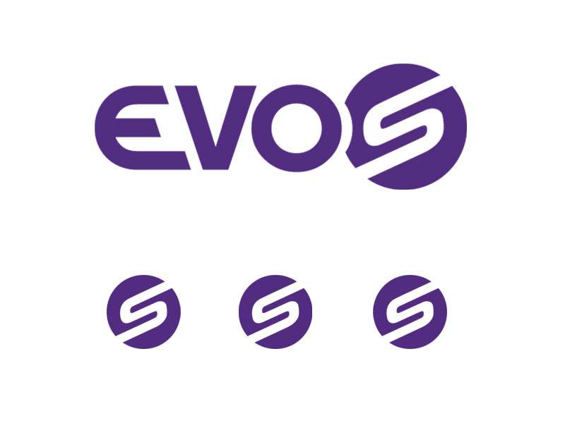
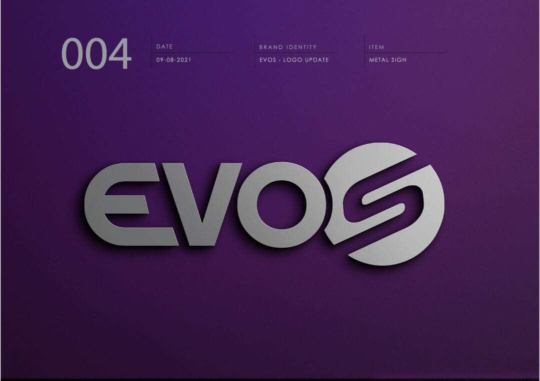
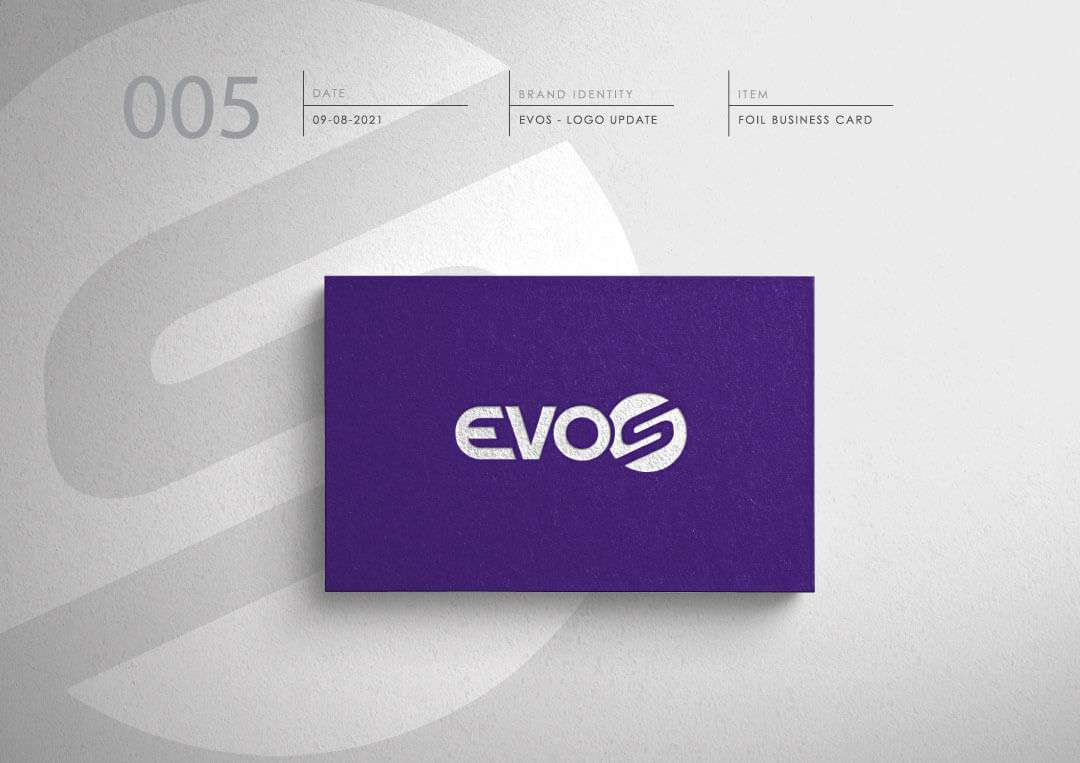
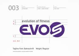
The client wanted to retain the purple and the original brand mark of the ‘S’ in a circle from the old logo into the new one, while incorporating the new company name EVOS.
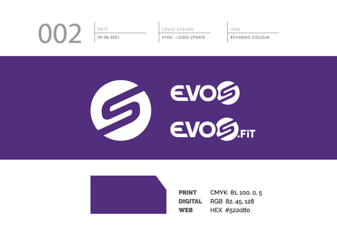
We accomplished this with a handcrafted typeface and rebuilt the original logo from scratch. The result was a pixel-perfect logo from start to finish. One of the more challenging aspects was finding a suitable purple that closely matched the original colour in CMYK and RGB.
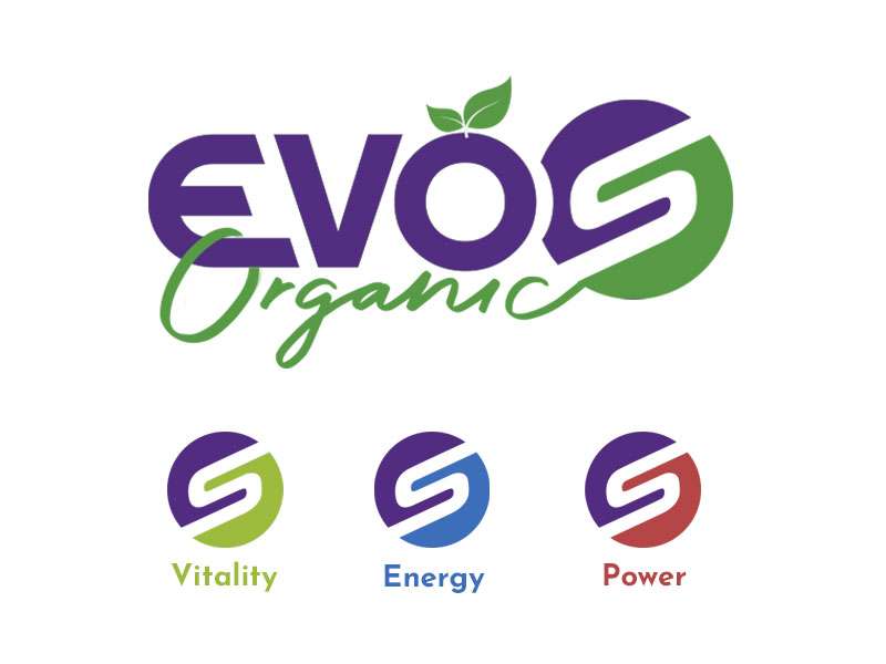
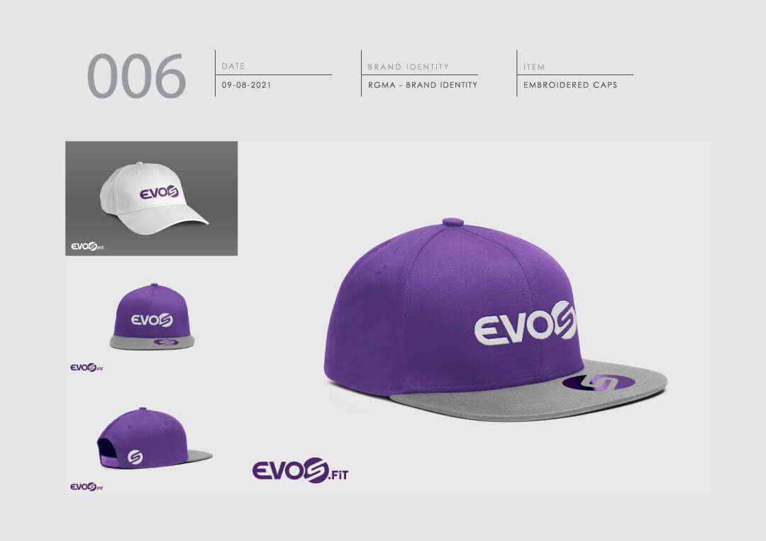
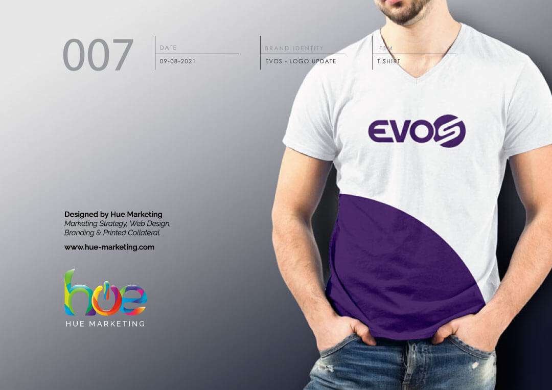
We also presented a number of colour variations, should they ever want to expand into new markets (which is common with the health and fitness industries). The screens below are a sample of the final business logo design and mockups.
VERSATILITY
As part of the logo redesign process, we also explored additional ways the Evos logo could be adapted in the event the brand needed to pivot its main offering or diversify in some way. Although different adaptations were never part of the project, they were a part of the re-design process.
Brands in the health and fitness space often re-position themselves or need to expand their portfolio of offerings. Ensuring the logo we presented had the capabilities to be flexible and adaptable was always an underlying factor for the redesign process.
