7 Must-Know Tips for Stunning Brochure Designs

Printed brochures remain one of the most powerful and versatile marketing tools a business can use. Yes, even in today’s digital dominated world, providing a tangible connection customers can trust.
While websites dominate online visibility, brochures stand out because they are tangible, portable, and leave a lasting impression. Imagine walking away from a trade show booth or showroom with something in hand that tells you everything you need to know about a brand—it’s much harder to ignore than a fleeting social media ad.
The purpose of this article is simple: to give you clear, actionable rules for designing brochures that actually work. Not the cluttered, boring ones people toss in the trash, but ones that spark curiosity, answer questions, and encourage action. We’ll walk you through seven essential rules—from knowing your audience to testing and refining your design—that will transform your brochure into a true marketing powerhouse.
This guide is for small business owners, marketers, and designers who want professional-quality brochures, leaflets & flyers without overwhelming complexity. Whether you’re planning a local campaign, launching a product, or promoting a service, these rules will help you stand out and connect with your audience effectively.
Understanding the Role of a Brochure

+ What a Brochure Does
A brochure is more than just folded paper—it’s a mini storytelling tool that combines visuals, text, and branding to communicate value. Unlike digital ads that vanish with a scroll, brochures stick around. They can sit on a desk, be handed out at an event, or mailed directly to potential customers. Each time someone picks it up, it gives your brand another chance to make an impression.
Brochures act as silent salespeople. They introduce your products or services, highlight benefits, and even answer frequently asked questions. For example, a real estate brochure might showcase available properties, while a spa or salon brochure might highlight packages and services. By blending information with appealing design, brochures persuade and build trust in ways that are both subtle and effective.
+ When to Use Brochures
Brochures shine in specific scenarios. At trade shows, they let visitors take your message home. In retail stores, they help customers learn about promotions without relying on staff. In direct mail campaigns, brochures give prospects something substantial to hold and read at their convenience.
Think of brochures as versatile companions to your larger marketing strategy. They can be used to launch a new product, introduce a service, or even explain complex processes in a simplified format. The beauty lies in their flexibility—you decide how much information to include and how best to present it.
+ Why Simplicity Matters
The temptation with brochures is to cram in everything your business does. But here’s the truth: less is more. A cluttered brochure overwhelms readers and drives them away. Simplicity, on the other hand, draws readers in. Clean layouts, focused text, and strong visuals are what make a brochure memorable.
Think of your brochure like a road sign—you want people to understand the message at a glance. When readers feel overloaded, they’ll put it down. But when the design is simple and direct, they’re more likely to engage, absorb the information, and take the next step.
A brochure can introduce your company and a range of services, or it can provide more information on a particular service. But it can’t do both at the same time.
Rule 1 – Know Your Audience

✓ Identify Your Readers
Before you start designing, ask yourself: who is this brochure for? Defining your audience is the foundation of an effective design. If you’re targeting young professionals, your brochure might need a sleek, modern look with concise messaging. If your audience is families, the tone should be warm, friendly, and perhaps even playful.
Think beyond age and demographics. Consider interests, pain points, and lifestyle choices. A brochure for a fitness center, for instance, could target people who want to lose weight, gain strength, or simply live healthier lives. Knowing exactly who you’re speaking to allows you to tailor your design, tone, and content to connect more deeply.
✓ Address Their Needs
Great brochures aren’t about what you want to say—they’re about what your audience needs to hear. Address customer pain points directly. A travel agency might highlight “stress-free vacation planning” rather than just listing destinations. A cleaning service brochure might emphasize “more free time for you” instead of just detailing packages.
By focusing on customer needs, your brochure becomes a solution rather than just another advertisement. People don’t buy products; they buy outcomes. Show how your service makes life easier, better, or more enjoyable, and your brochure will resonate.
✓ Keep It Relatable
Language and imagery should reflect your audience’s lifestyle and goals. Avoid jargon unless you’re speaking to a highly specialized audience. Instead, use words your customers use every day. For example, instead of “premium residential sanitation services,” say “affordable home cleaning.”
Images matter too. A brochure targeting students should feature vibrant, youthful visuals, while one for executives might lean toward sleek, professional imagery. Relatability creates connection, and connection builds trust—the ultimate goal of any marketing piece.
Rule 2 – Focus on a Clear Message

✓ One Key Idea
The most effective brochures revolve around a single, strong idea. Instead of trying to showcase everything your business does, zero in on one message. For example:
- “Discover Our New Fitness Programs” is sharper than “We Offer Classes, Equipment, and Nutrition Plans.”
- “Save Time with Our Home Cleaning Service” beats “We Provide Daily, Weekly, and Monthly Packages.”
By narrowing your focus, you make it easier for readers to remember what you stand for. A scattered message gets lost; a focused one sticks.
✓ Craft a Strong Headline
Your headline is the first thing readers see—and often the only thing they remember. Keep it short, impactful, and clear. Instead of generic lines like “Welcome to Our Company,” try action-driven phrases like “Transform Your Space Today” or “Your Stress-Free Vacation Awaits.”
A great headline doesn’t just grab attention; it sets the tone for the entire brochure. Think of it as the hook that convinces readers to keep exploring.
✓ Avoid Overloading Information
While it’s tempting to pack in details, your brochure isn’t meant to tell your whole story. It’s meant to spark interest. Too much text discourages reading. Instead, focus on essential points and direct readers to your website or contact details for more information.
Use bullet points, icons, and short paragraphs to keep content digestible. Remember: a brochure is a teaser, not a textbook.
Rule 3 – Prioritize Visual Appeal

✓ Use High-Quality Images
First impressions matter, and nothing ruins a brochure faster than low-quality, blurry images. Photos and graphics should be professional and align with your brand identity. A restaurant brochure, for example, should use mouth-watering food photography that makes readers crave a visit.
Stock images can work, but be careful—they often look generic. Whenever possible, invest in original photography that showcases your actual products, team, or location. This not only boosts credibility but also makes your brochure unique.
✓ Balance Colour & Contrast
Colours carry emotion and meaning. Blue suggests trust, red signals excitement, and green represents growth. Choose a palette that reflects your brand while making sure text is easy to read. Dark text on a light background is a safe bet, while clashing or overly bright colors can strain the eyes.
Contrast is just as important. If everything in your brochure is bold and colorful, nothing stands out. Use contrast to highlight key elements, like your headline or call to action.
✓ Keep Layout Clean
White space is your friend. A cluttered layout overwhelms readers, while a clean design guides their eyes smoothly from one section to another. Break content into sections with clear headings, use consistent margins, and avoid cramming too much into one panel.
Think of your brochure as a guided tour—you want to control where readers look and what they notice first. A clean layout ensures your message is not just seen but absorbed.
Rule 4 – Make Text Easy to Read

✓ Choose Simple Fonts
Fonts play a surprisingly big role in readability. Stick to one or two font families—one for headings and one for body text. Sans-serif fonts (like Arial or Helvetica) are modern and easy to read, while serif fonts (like Times New Roman) add a touch of formality. Avoid decorative or overly stylized fonts, as they can be hard to read in print.
Consistency is key. Switching fonts too often makes your brochure look amateurish. Instead, rely on bold, italics, or different sizes to create variety while staying within your chosen font set.
✓ Use Hierarchy
Hierarchy helps readers scan quickly. Headings, subheadings, and bullet points make it easy to pick out key details without reading every word. Important points should stand out through size, weight, or color.
For example, your headline could be bold and large, subheadings slightly smaller, and body text standard size. This visual hierarchy ensures readers can grasp your main points even if they only skim.
✓ Keep It Brief
In brochures, less truly is more. Short sentences and tight paragraphs make information digestible. Instead of long-winded descriptions, aim for clarity. For example:
- Long: “Our company provides comprehensive cleaning services that ensure your home is spotless and hygienic at all times.”
- Short: “We make your home shine, inside and out.”
Brevity keeps readers engaged and prevents your brochure from feeling overwhelming. This goes double for flyers.
Rule 5 – Include a Clear Call to Action

✓ Guide the Reader
A brochure without a clear call to action (CTA) is like a map without directions—it looks nice, but it doesn’t get you anywhere. Your CTA tells readers exactly what you want them to do next. Whether it’s “Visit Our Website,” “Call for a Free Quote,” or “Book Your Appointment Today,” the instruction must be specific, actionable, and easy to follow.
Think about the customer journey. If your brochure is about a new fitness program, the CTA could be “Sign Up for Your Free Trial Class.” If it’s for a home repair service, try “Schedule Your Free Home Inspection.” Notice how these go beyond vague prompts and instead give a clear next step.
Your CTA should also be visually distinct. Place it where readers naturally finish scanning—like the back panel or the bottom of each section—and use design elements such as bold fonts, color highlights, or buttons (in digital brochures) to draw attention.
✓ Make Contact Easy
Your readers shouldn’t have to struggle to figure out how to reach you. Include simple, straightforward contact details:
- Website URL (shortened if possible)
- Phone number
- Email address
- Social media handles
Avoid cluttering the brochure with too many options. Pick the channels your audience is most likely to use. For example, younger audiences might prefer Instagram, while older ones might lean toward phone or email.
Another pro tip: use QR codes. They allow readers to scan and instantly land on your website, booking page, or promotional offer. This reduces friction and increases the chance of immediate engagement.
✓ Create Urgency
People procrastinate—that’s human nature. Your job is to motivate action now, not later. Adding urgency to your CTA makes a huge difference. Phrases like “Limited Time Offer,” “Only 10 Spots Left,” or “Book Before Friday for a Discount” encourage readers to act immediately.
Urgency works because it triggers the fear of missing out (FOMO). But make sure it’s genuine—false urgency erodes trust. If you say “Offer ends tomorrow,” stick to it. Honesty paired with urgency is what drives results.
Rule 6 – Align with Your Brand

✓ Consistent Branding
Your brochure isn’t just a standalone piece—it’s part of your brand’s larger identity. That means your logo, colors, fonts, and overall style should match your website, social media, and other marketing materials. Consistency creates instant recognition and reinforces trust.
For instance, if your brand color palette is navy blue and gold, your brochure should reflect those same shades. Using completely different colors would confuse readers and weaken your branding. Likewise, your logo should appear prominently but not overpower the design.
Consistency also extends to tone. If your brand voice is professional and authoritative, your brochure text should reflect that. If it’s playful and casual, keep the copy light and approachable.
✓ Reflect Brand Personality
A brochure is more than facts and visuals—it’s a reflection of your brand’s personality. Ask yourself: what does my business sound like if it were a person? A law firm might use a serious, authoritative tone, while a café might use warm, inviting language.
This personality should shine through in every aspect of your brochure:
- Design: Sleek layouts for high-end brands, colorful graphics for creative ones.
- Language: Formal wording for professional industries, casual wording for lifestyle businesses.
- Imagery: Polished photography for luxury brands, candid images for approachable ones.
When your brochure feels authentic to your brand, readers are more likely to connect emotionally.
✓ Use a Style Guide
A brand style guide is your cheat sheet for staying consistent. It defines your logo usage, fonts, colors, tone of voice, and more. If you don’t have one yet, consider creating one—it saves time and ensures every piece of marketing looks and feels aligned.
Following a style guide when designing brochures avoids mistakes like using off-brand colors or mismatched fonts. It also ensures that whether a brochure is designed by you, your team, or a hired designer, it always feels unmistakably yours.
Rule 7 – Test and Refine
✓ Get Feedback
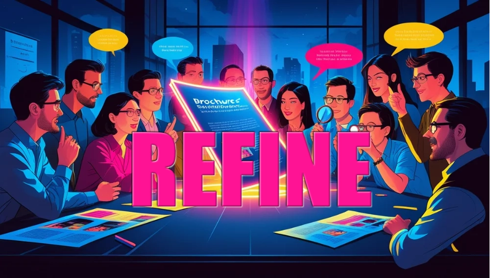
Before you print hundreds—or thousands—of brochures, get feedback. Show your draft to colleagues, friends, or even a small sample of your target audience. Ask questions like:
- Does the headline grab your attention?
- Is the message clear?
- Would you take action after reading this?
Honest feedback helps catch issues you might have missed, like confusing text or weak visuals. Fresh eyes often see what the creator overlooks.
✓ Check Readability
Never assume your design looks perfect until you test it in real life. Print a test copy and examine it closely. Fonts that looked fine on screen might be too small in print. Colors that looked vibrant digitally might appear dull when printed.
Pay attention to how the brochure folds, too. Important information should not land in awkward creases or hidden areas. Remember: a brochure is both visual and tactile. Its physical form plays a big role in readability and impact.
✓ Simplify if Needed
When in doubt, simplify. If your brochure feels crowded, trim the text, reduce the number of images, or adjust the layout. Clarity always beats complexity.
Ask yourself: if someone flips through this brochure in 10 seconds, will they understand my key message and next step? If the answer is no, refine until it’s crystal clear.
Testing and refining aren’t optional—they’re the difference between a brochure that gets tossed aside and one that drives action.
Common Mistakes to Avoid
✗ Overcrowding the Design
One of the biggest mistakes businesses make when designing brochures is trying to fit everything onto the page. Too many images, too much text, and too many design elements compete for attention and overwhelm readers. Remember, a brochure is not a catalog or a full company profile—it’s a snapshot meant to spark interest.
When readers are bombarded with clutter, they don’t know where to focus, and your key message gets lost. The fix is simple: embrace white space. Allow breathing room around text and images so each element stands out. Focus only on the most essential information, and guide readers with a logical flow. A clean, minimalist design looks professional and leaves a stronger impression than a crowded layout.
✗ Ignoring the Fold
The fold of a brochure isn’t just a structural detail—it’s a design element that impacts how people interact with your content. For example, in a tri-fold brochure, the front panel is the “cover” that draws people in. If your headline or imagery on this panel isn’t compelling, chances are readers won’t open it.
Another common mistake is hiding critical information in folds or placing visuals that don’t align once folded. Always design with the folds in mind. Think of the panels as chapters in a story, guiding readers from curiosity to interest to action. A well-thought-out fold creates flow, while a poorly considered one creates confusion.
✗ Forgetting the Audience
It’s easy to fall into the trap of designing a brochure you personally like rather than one that speaks to your audience. But what appeals to you may not resonate with your customers. For instance, you might love flashy colors, but if your audience is made up of corporate executives, they might prefer something more understated and professional.
To avoid this mistake, revisit Rule #1: Know Your Audience. Every design choice—from imagery to language to layout—should be based on what appeals to your readers, not just your own preferences. When your audience feels seen and understood, your brochure becomes far more effective.
Practical Tips for Production

✓ Choose the Right Format
Not all brochures are created equal. The format you choose should match both your content and your budget. Common types include:
- Tri-fold brochures: Compact, versatile, and perfect for step-by-step storytelling.
- Bi-fold brochures: Clean and simple, offering more space per panel for visuals and text.
- Gatefold brochures: Dramatic and eye-catching, ideal for luxury brands or product launches.
- Z-fold brochures: Great for brochures that need to showcase multiple options, like menus or travel itineraries.
The format impacts how readers experience your message. For instance, if you’re presenting a detailed product lineup, a bi-fold or gatefold may give you more room to breathe. For quick, digestible information, a tri-fold is often best. Always balance your choice between practicality and creativity.
✓ Work with Professionals
Yes, online design tools like Canva Pro or Adobe Express make brochure creation accessible to everyone. But if your goal is to make a big impact, consider working with professionals—either a graphic designer or a reputable printing service.
Designers bring expertise in layout, typography, and branding that most DIY tools can’t replicate. They know how to make your brochure not just look good but also work effectively as a marketing piece. Meanwhile, professional printers ensure high-quality paper, crisp colors, and precise folds—details that elevate your brochure from “homemade” to “polished.”
If budget is tight, you can still design the brochure yourself but outsource the printing to ensure professional results. Even small details like glossy finishes or heavy cardstock can make your brochure stand out.
✓ Proofread Carefully
Few things hurt credibility faster than a typo in print. Once a brochure is printed, mistakes are costly to fix. That’s why proofreading is critical. Check for spelling, grammar, and punctuation errors, but also verify contact details, pricing, and dates.
Here’s a quick checklist before sending your brochure to print:
- Double-check phone numbers and email addresses.
- Verify website URLs and QR codes.
- Make sure prices and offers are accurate and up-to-date.
- Read every sentence aloud to catch awkward phrasing.
Better yet, have multiple people review it. Fresh eyes catch errors you may overlook. Investing extra time in proofreading saves money, protects your reputation, and ensures your brochure does its job effectively.
❝A brochure isn’t the end of the sales journey—it’s the beginning of trust.❞

Designing an effective brochure doesn’t need to be complicated—it just needs to be intentional. A brochure isn’t simply a folded piece of paper; it’s a portable salesperson, a storyteller, and a brand ambassador all rolled into one. Done right, it grabs attention, builds trust, and motivates readers to take action.
Let’s recap the seven essential rules that make brochures powerful:
- Know Your Audience – Design with your readers in mind, not yourself.
- Focus on a Clear Message – Stick to one strong idea instead of trying to say everything.
- Prioritize Visual Appeal – Use professional images, balanced colors, and a clean layout.
- Make Text Easy to Read – Choose simple fonts, create hierarchy, and keep content concise.
- Include a Clear Call to Action – Tell readers exactly what step to take next and make it easy.
- Align with Your Brand – Ensure design, tone, and visuals match your overall branding.
- Test and Refine – Print test copies, get feedback, and simplify where needed.
By following these rules, you create brochures that don’t just look nice—they work. They tell your story, showcase your value, and invite readers into action.
So, whether you’re preparing for a local campaign, launching a new product, or promoting your services, approach your brochure with purpose. Keep it simple, professional, and customer-focused. Remember, a well-designed brochure is not just paper—it’s an investment in your business growth..
Want to make sure your next brochure is a success? Take the next step:
- Contact Hue Marketing for a consultation to elevate your brochure strategy, refine your messaging, and maximize your results.
Don’t let your brochures end up in the recycling bin—turn them into marketing tools that convert.
Founder of Hue Marketing | Marketing Strategist | Creative Problem Solver
With 30+ years of experience, I help businesses in high-end markets solve complex challenges through strategic insights and quality-driven solutions. Based in Phuket since 2003, I focus on building long-term marketing foundations that drive brand differentiation, higher conversion rates, and lasting customer loyalty.
Frequently Asked Brochure Questions
Why should I use brochures when digital marketing is so popular?
Brochures provide a physical, tangible connection that digital ads can’t replicate. They’re portable, easy to share, and can sit on a desk as a reminder of your brand. Combined with digital marketing, brochures create a well-rounded, multi-channel strategy.
What’s the best size for a brochure?
It depends on your goals. Tri-fold brochures (8.5” x 11”) are the most common and versatile. However, larger formats like gatefolds are great for high-impact presentations, while smaller sizes work well for quick handouts.
How many images should I include in my brochure?
Quality matters more than quantity. One strong image per panel is often enough. Too many images can clutter the layout, while a few high-quality visuals can capture attention and support your message effectively.
Should I print brochures in bulk or small batches?
If your content is evergreen (not changing often), bulk printing saves money. For time-sensitive promotions, print smaller batches so you can update details easily. Digital printing makes short runs affordable and flexible.
What’s the most important element of a brochure?
While every element plays a role, the headline and call to action carry the most weight. The headline grabs attention, and the CTA drives action. Without those two working together, even the most beautiful design may not deliver results.


Leave a Reply
Want to join the discussion?Feel free to contribute!