Hue Marketing Logo Design
How our own logo was created.
What Is Hue Marketing
Hue Marketing is a Phuket-based marketing agency. Founded in 2014, we use a combination of Consulting, Website Design & Graphic design projects to help build trust for our clients and motivate customers to take action through effective & measurable marketing.
Marketing is a complex, diverse, and essential part of every business. There is no fixed solution that works for everyone, or every situation. When one of the fundamental challenges of marketing is to stand out in a crowd, highlighting what makes you unique (better) than your competition isn’t something you can find in a template.
We focus on helping small to medium businesses with their marketing; from strategy to implementation. Drawing on over 25 years of hands-on marketing experience we help our clients gain the maximum return from any marketing budget.
What Was Required
The term “hue” is often used interchangeably with the word “colour”, but “hue” is more specific, referring to the actual shade of a colour. It’s a subtle but important difference. Marketing is also one of those words that are often oversimplified. So we wanted the Hue Marketing logo to represent the complexity of marketing and our creativity and attention to detail.
It needed to be creative, and uniquely identifiable. It also had to be functional so working with light and dark backgrounds was essential as too as the ability to use it in a single colour.
What We Did
Being both client and designer for this project was particularly difficult, mainly because you have the option to do anything you like. Although it sounds great, it’s not the most productive place to start. To combat this, we treated ourselves just like any other client and wrote a creative design brief to highlight our key points and how we wanted people to feel when they viewed our logo.
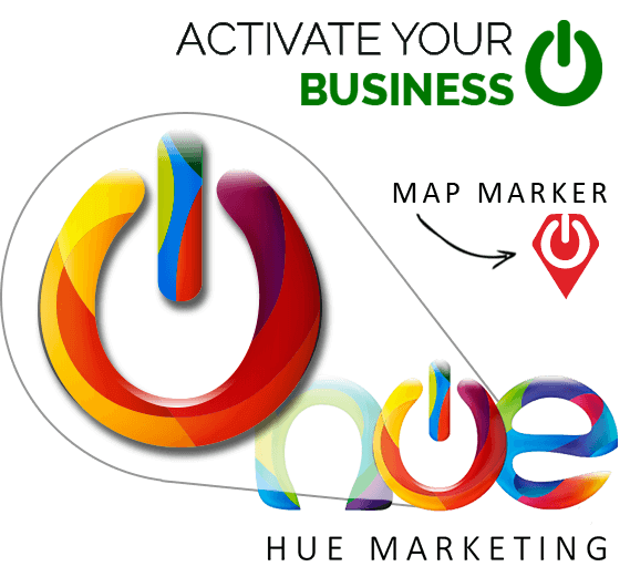
Dynamic, Creative, Activate / Empower, Start, Power Up, Hopeful, Optimistic and Detailed were some of the first impressions we chose to aim for. But it also needed to be readable and versatile. Multicoloured logos are great in principle but don’t always translate to mono colour in a newspaper or stamp, so this would mean extensive testing.
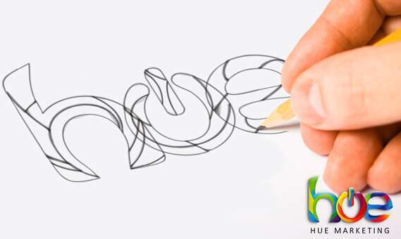
We created a few designs and picked elements that we liked from some and stripped away elements that were superfluous.
The End Result
The final Hue Marketing Logo is probably still more complicated (in its design process and creation) than it probably needed to be, but we set ourselves quite a complicated task because we wanted to convey so many things in our logo design.
The letters are fully custom hand-made letterforms. Although the letters overlap in the finished logo they are also available as individual letters since we wanted the option to have an animated logo version at some point. (see the logo on our home page when you scroll up and down).
Could we have gone down a more simple route? Probably yes. If we were going to do it again, would we do it differently? No way!
If it’s worth doing it’s worth doing right!
