Buathip
Logo Update

An upgrade to an existing logo design

Buathip Branding Update
  • What Is Buathip

    Buathip Natural Herbal Remedies manufacture and distribute traditional Thai herbal medicine. Their products use 100% natural. Available online at www.buathip.com and in retail outlets throughout Thailand.

  • What was required

    The ORIGINAL Buathip logo was created through fiverr.com. It was hard to read, looked dated, and wasn’t adaptable to the variety of end-use applications needed.  There wasn’t a print version (CMYK), it became unreadable when small.  It also didn’t work for social media profiles and there wasn’t a SVG version for modern website design.

    Not ideal for a new brand to break into a very competitive market. So it needed fixing.

    Because the original logo was already in use across the entire product range. replacing it with a totally different logo would not have been practical. Therefore our challenge was to change it enough to solve the issues but not so much that it looked like a different brand.

    These are the issues we wanted to address:

    Readability
    The tagline “Natural Herbal Remedies” that described what the products were was almost unreadable.

    Adaptability
    Any decent logo must work on both light and dark backgrounds.  The original designer provided only 1 version that worked on a white background.

    Versatility
    Modern logos need to work online from websites to social media. The majority of Social media profile images are square. So a wide-format logo becomes unreadable. So we also needed a square version.

    Quality
    We also felt the original logo looked a little on the cheap side. So we wanted to add a bit of polish to reflect the attention to detail and professionalism of the company, and its products.

    There were several other technical issues with the original design that didn’t sit well. From the three different fonts to the dated figure. But even worse the original lotus flower in the design was a photo.  From a print standpoint alone the original logo was a dud.

  • What We Did

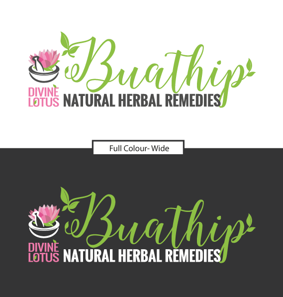
    We kept the main typeface used for “Buathip” and incorporated the leaves onto the name to re-enforce the natural element of the brand.

    To make sure that when people saw the logo for the first time, they will immediately know what Buathip is all about. We really bumped up the tagline of Natural Herbal Remedies.

    We also retained the pestle and mortar element to represent the traditional herbal origins behind the company. The character in the bowl didn’t represent anything, so it went in the bin. And we created a new vector lotus leaf (petal by petal) and used the same colour for the Divine Lotus text.

    We refreshed the colour pallet, using more vibrant colours to represent new life, health and vitality. And we created versions for both light and dark backgrounds (including mono versions). This way the logo works anywhere, including b&w newspapers and full-colour magazines.

    Finally, we created square versions for Social Media Profiles, plus a nice Fav icon (because we knew they will need one).

  • The End Result

    Because the new logos are 100% vector graphics. It doesn’t matter what size you need, every line will remain crisp and clear. Meaning that this logo can be used for years to come, in any situation that they need. The client now even has the option to embroider their logo onto shirts (which wouldn’t have been possible before).

    We also kept the new logo to a similar footprint as the original. An intentional decision planning for the update of product labels in the future. Without needing an expensive product label redesign.

    If it’s worth doing it’s worth doing right!
Original Logo

Original Buathip Logo Design | Hue Marketing

NEW Updated Logo

Buathip Wide Logo in Full Colour
Buathip Wide Logo (Black and White)
Buathip Social Media and Fav icons | Hue Marketing
Original Buathip Logo Before Updatev1 | Hue MarketingNew Buathip Logo After Update | Hue Marketing
BeforeAfter

What Is Buathip

Buathip Natural Herbal Remedies manufacture and distribute traditional Thai herbal medicine. Their products use 100% natural. Available online at www.buathip.com and in retail outlets throughout Thailand.

What Was Required

The ORIGINAL Buathip logo was created through fiverr.com. It was hard to read, looked dated, and wasn’t adaptable to the variety of end-use applications needed.  There wasn’t a print version (CMYK), it became unreadable when small.  It also didn’t work for social media profiles and there wasn’t a SVG version for modern website design.

Not ideal for a new brand to break into a very competitive market. So it needed fixing.

Because the original logo was already in use across the entire product range. replacing it with a totally different logo would not have been practical. Therefore our challenge was to change it enough to solve the issues but not so much that it looked like a different brand.

These are the issues we wanted to address:

Readability
The tagline “Natural Herbal Remedies” that described what the products were was almost unreadable.

Adaptability
Any decent logo must work on both light and dark backgrounds.  The original designer provided only 1 version that worked on a white background.

Versatility
Modern logos need to work online from websites to social media. The majority of Social media profile images are square. So a wide-format logo becomes unreadable. So we also needed a square version.

Quality
We also felt the original logo looked a little on the cheap side. So we wanted to add a bit of polish to reflect the attention to detail and professionalism of the company, and its products.

There were several other technical issues with the original design that didn’t sit well. From the three different fonts to the dated figure. But even worse the original lotus flower in the design was a photo.  From a print standpoint alone the original logo was a dud.

What We Did

We kept the main typeface used for “Buathip” and incorporated the leaves onto the name to re-enforce the natural element of the brand.

To make sure that when people saw the logo for the first time, they will immediately know what Buathip is all about. We really bumped up the tagline of Natural Herbal Remedies.

We also retained the pestle and mortar element to represent the traditional herbal origins behind the company. The character in the bowl didn’t represent anything, so it went in the bin. And we created a new vector lotus leaf (petal by petal) and used the same colour for the Divine Lotus text.

We refreshed the colour pallet, using more vibrant colours to represent new life, health and vitality. And we created versions for both light and dark backgrounds (including mono versions). This way the logo works anywhere, including b&w newspapers and full colour magazines.

Finally, we created square versions for Social Media Profiles, plus a nice Fav icon (because we knew they will need one).

The End Result

Because the new logos are 100% vector graphics. It doesn’t matter what size you need, every line will remain crisp and clear. Meaning that this logo can be used for years to come, in any situation that they need. The client now even has the option to embroider their logo onto shirts (which wouldn’t have been possible before).

We also kept the new logo to a similar footprint as the original. An intentional decision planning for the update of product labels in the future. Without needing an expensive product label redesign.

If it’s worth doing it’s worth doing right!

Ready to Get Started?

We create stunning sales tools that let you focus on sealing the deal!